Project Proposal
Start of Project Proposal Transclusion
retrieving project proposal...
End of Project Proposal Transclusion
The National Oceanic and Atmospheric Administration (NOAA) currently hosts a visualization, "Climate at a Glance," which allowed most of the early exploratory data analysis to be done. After most of the visualization had been implemented for this project, I used my own visualization to do additional exploration previously not possible in the NOAA visualization. In particular was looking at the histogram of the distributions of temperature anomalies for select geographic locations. I exported several subsets of the temperature anomaly data to Excel and used PivotTables and PivotCharts to group by month. Seeing interesting features in the monthly groups, I decided to add a heatmap and radial line chart to the visualization.
The key highlights about the software architecture I'd like to point out are:
As discussed in the project proposal, the gridded temperature anomaly dataset is provided in the NetCDF v4 format. I found that converting to JSON or CSV not only degrades performance, but is entirely impractical as the file size balloons to 1–2 GB. This is not only impractical in terms of bandwidth, but also in terms of the user's RAM memory.
In order to overcome this hurdle, the gridded temperature anomaly dataset was loaded in its binary format as an array buffer in JavaScript before being passed to netcdfjs, which copies the data into JavaScript arrays. I had to be extremely careful when working with so much data, and developed a series of techniques that: maintains the binary IEEE machine representation of the temperature anomaly, and limits data movement.
Here's an overview of the techniques developed:
Using these techniques, loading and processing times were reduced from minutes to under 600 miliseconds. The browser's memory footprint was similarly reduced from 2–4 GB to 50 MB.
Two additional datasets were used in addition to the gridded temperature anomaly dataset:
Allows the user to switch between Celsius and Fahrenheit using interposition discussed in Data wrangling.
The visualization will automatically detect whether the user is using a dark color theme (e.g. dark mode in MacOS Mojave) and will adapt its color theme accordingly. This can be overridden by the user. While implementing this feature, I found that some visualizations, the Radial charts for example, to be subjectively better in the dark theme than in the light theme. While I tried to picked the color scheme to be immune to this, I hypothesize that this phenomenon is due to brightness not being perceived linearly. For example, variations in darker colors may be perceived more strongly than variations in lighter colors.
While easily overlooked, and in contrast to the homework, I implemented tooltips to position itself directly over the highlighted element instead of following the mouse. I found that this made tooltips easier to read and reinforces which element the tooltips were referring to.
All five views are linked and interactive.
This feature was heavily discussed in the project proposal and feedback exercise, and I decided to implement both the map in both 2D and 3D. When the visualization is initialized, the positions containing the highest and lowest anomalies are selected, which helps answers the questions posed in the project objectives.
Allows the user to switch between 2D and 3D projections, reset to visualization to its initial state, hide/show the average dataset, and control which positions on the map are shown in the other views.


The user can drag to manipulate the orientation of the map, and click to add or remove selected positions.
This feature was also discussed in the project proposal and answers questions regarding the temporal features in the dataset. I found that the data, especially over land and near the poles, to contain a lot more features than I initially anticipated. For that reason:
I added a month filter, allowing the user to focus on specific months in the dataset

and the ability to zoom into specific time periods. The user can either drag the time slider or click on the chart to change the time shown in the map. Instead of clipping the chart when it went off the viewport, I had it fade out emphasizing the chart extends beyond what is currently shown.
I embedded a bar chart in the tooltip to allow the user to compare temperature anomalies for different positions at a specific time. Position is encoded as the color of the text, and matches the map and other views. While the data is diverging, I had the bars run in the same direction in order to allow the user to compare the magnitude of the anomaly, with the color signifying the direction. The reason for this design decision is, for example, while it may be summer in the arctic, it's winter in the antarctic, and I wanted the user to be able to see if a positive anomaly in the arctic is of the same magnitude of a negative anomaly in the antarctic.
The next three views detail specific distributions in the data, each using a different encoding to emphasize a different feature. The user can switch between these views by clicking on the tab.
Most of these views were not a part of the original project proposal, but were added after observing interesting features in the map and line chart.
The first tab shows the data in the line chart. Taking inspiration from Taggle, a histogram is shown above the each of the column headers. Clicking on the column headers sorts the data, and this sort order is maintained as the other views are manipulated. Clicking on the rows changes the selected date in the map and line chart. In contrast to the bar chart in the line chart's tooltip, I used a diverging bar chart to emphasize the direction of the anomaly over time and not just magnitude at a specific point in time. The map, histogram, and diverging bar chart all use the same set of scales to allow for comparisons.
| Date | Avg | 222.5°, 62.5° | 77.5°, -82.5° | 247.5°, 42.5° | 12.5°, 47.5° |
|---|---|---|---|---|---|
| 2019-09 | 0.66 | 2.42 | -4.52 | 0.42 | 0.99 |
| 2018-09 | 0.54 | -1.01 | -3.96 | 1.81 | 2.10 |
| 2017-09 | 0.57 | 2.02 | -2.85 | 0.17 | -0.96 |
| 2015-09 | 0.66 | -0.11 | -2.63 | 2.20 | 0.26 |
| 2016-09 | 0.66 | 0.93 | -2.59 | 0.42 | 2.79 |
| 2012-09 | 0.46 | 1.64 | -1.89 | 1.94 | 0.81 |
| 2008-09 | 0.27 | 0.31 | 0.23 | 0.26 | -0.88 |
| 2007-09 | 0.30 | 0.42 | 1.07 | 0.32 | -1.29 |
| 2010-09 | 0.34 | -0.17 | 1.68 | 1.26 | -0.93 |
| 2009-09 | 0.44 | 0.98 | 1.69 | 2.65 | 1.68 |
| 2006-09 | 0.36 | 1.47 | 2.25 | -0.69 | 2.57 |
| 2011-09 | 0.31 | 0.73 | 3.41 | 2.02 | 2.55 |
| 2005-09 | 0.40 | 1.26 | 3.72 | -0.24 | 1.31 |
| 2014-09 | 0.50 | 0.48 | 4.93 | 1.51 | 0.85 |
| 2013-09 | 0.40 | 1.59 | 6.48 | 1.11 | 0.27 |
| 1993-09 | -0.11 | 0.41 | -0.46 | -0.63 | |
| 1994-09 | 0.04 | -0.42 | 1.99 | 0.81 | |
| 1995-09 | 0.12 | 3.63 | 0.75 | -1.30 | |
| 1996-09 | -0.04 | -1.03 | -1.23 | -2.70 | |
| 1997-09 | 0.33 | 1.75 | 1.02 | 1.00 | |
| 1998-09 | 0.24 | 0.04 | 2.32 | -0.23 | |
| 1999-09 | 0.10 | 0.37 | -0.70 | 2.51 | |
| 2000-09 | 0.14 | -1.06 | -0.04 | 0.57 | |
| 2001-09 | 0.25 | 0.99 | 2.56 | -1.93 | |
| 2002-09 | 0.30 | 0.78 | 0.42 | -0.80 | |
| 2003-09 | 0.36 | -1.66 | 0.36 | 0.17 | |
| 2004-09 | 0.27 | -1.90 | -0.48 | 0.59 |
The second tab shows a heatmap of temperature anomalies for each position broken down by year and month. It uses the same color scale as the map, and emphasizes both monthly cycles and yearly trends. For example, anomalies near antarctica are greatest during winter (April through October) in addition to a gradual upward trend in its averages. The heatmap also shows gaps in the instrumental temperature record where data is not available, which shows the difficultly of acquiring measurements during certain times of the year.
Clicking on the heat map changes the selected date and month for the map and line chart.
Jan | Feb | Mar | Apr | May | Jun | Jul | Aug | Sep | Oct | Nov | Dec | |
|---|---|---|---|---|---|---|---|---|---|---|---|---|
| 1988 | -0.17 | -0.12 | 0.02 | -0.30 | 1.31 | -1.94 | 0.33 | -5.30 | 0.37 | -0.79 | -1.26 | 0.39 |
| 1989 | -1.00 | -0.56 | 0.01 | -3.53 | 2.91 | 3.26 | 8.33 | 4.90 | 3.88 | 2.21 | 0.16 | 0.20 |
| 1990 | 0.05 | 0.28 | 0.23 | -0.17 | -0.09 | 4.36 | 1.73 | 1.20 | -0.03 | 0.41 | 0.94 | -0.41 |
| 1991 | -0.02 | 0.08 | -0.35 | 0.27 | -4.39 | -3.84 | 0.04 | 0.70 | 0.17 | -3.49 | 1.34 | -1.21 |
| 1992 | -0.59 | -0.66 | -0.88 | 0.57 | -3.69 | -2.54 | -3.07 | 1.50 | 2.57 | 1.12 | 0.24 | 0.45 |
| 1993 | 0.22 | 0.03 | -0.21 | -0.08 | 2.71 | 2.56 | 2.23 | 1.70 | -4.33 | 0.61 | 2.24 | -0.13 |
| 1994 | -0.12 | -0.06 | -0.08 | -0.22 | -0.59 | -1.24 | -6.07 | 2.70 | 4.67 | -4.59 | 1.74 | -1.41 |
| 1995 | -0.21 | -0.21 | -0.24 | -0.22 | -0.99 | -1.64 | -5.87 | -4.80 | -1.53 | 0.01 | -2.46 | -0.71 |
| 1996 | -0.07 | 0.04 | 0.35 | 0.21 | 0.17 | |||||||
| 1997 | 0.28 | 0.10 | 0.24 | 0.14 | ||||||||
| 1998 | -0.52 | -0.11 | ||||||||||
| 1999 | 0.00 | 0.17 | 0.07 | 0.17 | 0.34 | 0.06 | ||||||
| 2000 | 0.15 | 0.20 | 0.14 | 0.15 | 0.16 | |||||||
| 2001 | -0.74 | -0.72 | 0.06 | 0.00 | 0.16 | |||||||
| 2002 | 0.03 | -0.09 | -0.65 | -0.28 | -0.58 | |||||||
| 2003 | -0.84 | -0.75 | -0.19 | -0.41 | -0.71 | |||||||
| 2004 | -0.45 | -0.21 | -0.13 | -0.30 | ||||||||
| 2005 | -0.37 | -0.24 | -0.76 | -0.16 | -0.63 | |||||||
| 2006 | -0.59 | -0.46 | -0.12 | 0.03 | 0.36 | 0.01 | ||||||
| 2007 | -0.45 | -0.49 | -0.85 | -0.66 | ||||||||
| 2008 | -0.79 | -0.56 | -0.85 | -0.07 | -0.02 | -0.13 | ||||||
| 2009 | 0.10 | -0.08 | -0.07 | -0.45 | -0.13 | |||||||
| 2010 | -0.91 | -0.96 | -0.17 | |||||||||
| 2011 | -0.24 | -0.21 | 0.02 | -0.37 | -0.08 | |||||||
| 2012 | -0.27 | -0.58 | -0.65 | |||||||||
| 2013 | ||||||||||||
| 2014 | -1.10 | -1.10 | -0.99 | |||||||||
| 2015 | -0.69 | |||||||||||
| 2016 | -0.83 | -0.81 | -0.68 | -0.13 | -0.44 | -0.79 | ||||||
| 2017 | -0.97 | -0.82 | -0.63 | -0.72 | -0.37 | |||||||
| 2018 | -0.09 | 0.01 | -0.15 | -0.10 | -0.37 | |||||||
| 2019 | -0.45 | -0.74 | -0.67 |
The third tab shows a radial line chart for each position. It focuses exclusively on monthly trends, and is the most experimental feature in the visualization: known only to work correctly in Google Chrome on Windows.
For the brushed date range in the line chart, it loops a semi-transparent line around in a circle. Where the line overlaps, it darkens, which allows the user to quickly visualize the distribution of anomalies by month for a specific date range. Clicking on the chart changes the selected month in the line chart, which may result in updates being propagated to the map and data table.
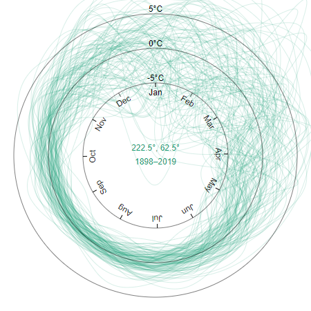
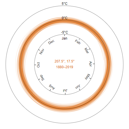
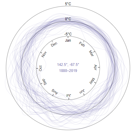
I took several screenshots in Google Chrome on Windows for a position near the arctic, in the ocean near the equator, and in the antarctic—to emphasize how anomalies tend to be greatest when: over land, near the poles, and during winter. The antarctic radial line chart is fainter in general because less data is available near antarctica.
The NetCDF format is self-describing, and the last section in the visualization prints out its metadata. For example: how the baseline is calculated, measurement techniques, and references to journal papers detailing the metholodgy of how the dataset was assembled.
...
references char Vose, R. S., et al., 2012: NOAAs merged land-ocean surface temperature analysis. Bulletin of the American Meteorological Society, 93, 1677-1685. doi: 10.1175/BAMS-D-11-00241.1. Huang, B., Peter W. Thorne, et. al, 2017: Extended Reconstructed Sea Surface Temperature version 5 (ERSSTv5), Upgrades, validations, and intercomparisons. J. Climate, 30, 8179-8205. doi: 10.1175/JCLI-D-16-0836.1
climatology char Climatology is based on 1971-2000 monthly climatology
...
There isn't one story to be told in the NOAA Merged Land Ocean Global Surface Temperature Analysis (NOAAGlobalTemp) V5 dataset, and I didn't want this visualization to be the end, but the beginning of further analysis. For this reason, I designed the visualization to be a tool used by experts to explore and export interesting features in the instrumental temperature record.
For example, the user can copy or download the the data table in CSV for their own analysis and presentation
in addition to serializing the DOM and exporting an SVG of the map or line chart.
While exploring the data, here are some interesting features I observed in the data.
Global warming is the increase in the average near surface temperature, and becomes most apparent when looking solely at the average temperature anomalies. The World Meterological Organization (WMO) recommends a 30 year baseline period to distinguish between weather and climate, and this can shown by shifting a 30 year wide brush in the line chart and observing the changes in the data table histogram.

Snow changes surface albedo, that is the amount of solar energy reflected back into space. As snow falls, surface albedo increases, which drives further cooling as more energy is reflected back into space, which lowers temperature and drives more snow fall. Likewise, as snow melts, surface albedo decreases, which drives further warming as more energy is absorbed, which raises temperatures and causes more snow to melt. This diverging effect creates a situation where the distribution of surface temperature during winter widens to the point where the temperature anomalies become bimodal. This can be shown in the tabbed data views when tweaking the filters.
| Date | Avg | 222.5°, 62.5° | 77.5°, -82.5° |
|---|
Large bodies of water have a strong stabilizing effect on temperature.
Temperature anomalies tend to be larger near the poles.
Despite the poles having interesting variations in temperature anomalies, measurements are harder to take. The sensors near palmer's peninsula is a good example of this with year-round measurements ending in 1995.
Jan | Feb | Mar | Apr | May | Jun | Jul | Aug | Sep | Oct | Nov | Dec | |
|---|---|---|---|---|---|---|---|---|---|---|---|---|
| 1988 | -0.17 | -0.12 | 0.02 | -0.30 | 1.31 | -1.94 | 0.33 | -5.30 | 0.37 | -0.79 | -1.26 | 0.39 |
| 1989 | -1.00 | -0.56 | 0.01 | -3.53 | 2.91 | 3.26 | 8.33 | 4.90 | 3.88 | 2.21 | 0.16 | 0.20 |
| 1990 | 0.05 | 0.28 | 0.23 | -0.17 | -0.09 | 4.36 | 1.73 | 1.20 | -0.03 | 0.41 | 0.94 | -0.41 |
| 1991 | -0.02 | 0.08 | -0.35 | 0.27 | -4.39 | -3.84 | 0.04 | 0.70 | 0.17 | -3.49 | 1.34 | -1.21 |
| 1992 | -0.59 | -0.66 | -0.88 | 0.57 | -3.69 | -2.54 | -3.07 | 1.50 | 2.57 | 1.12 | 0.24 | 0.45 |
| 1993 | 0.22 | 0.03 | -0.21 | -0.08 | 2.71 | 2.56 | 2.23 | 1.70 | -4.33 | 0.61 | 2.24 | -0.13 |
| 1994 | -0.12 | -0.06 | -0.08 | -0.22 | -0.59 | -1.24 | -6.07 | 2.70 | 4.67 | -4.59 | 1.74 | -1.41 |
| 1995 | -0.21 | -0.21 | -0.24 | -0.22 | -0.99 | -1.64 | -5.87 | -4.80 | -1.53 | 0.01 | -2.46 | -0.71 |
| 1996 | -0.07 | 0.04 | 0.35 | 0.21 | 0.17 | |||||||
| 1997 | 0.28 | 0.10 | 0.24 | 0.14 | ||||||||
| 1998 | -0.52 | -0.11 | ||||||||||
| 1999 | 0.00 | 0.17 | 0.07 | 0.17 | 0.34 | 0.06 | ||||||
| 2000 | 0.15 | 0.20 | 0.14 | 0.15 | 0.16 | |||||||
| 2001 | -0.74 | -0.72 | 0.06 | 0.00 | 0.16 | |||||||
| 2002 | 0.03 | -0.09 | -0.65 | -0.28 | -0.58 | |||||||
| 2003 | -0.84 | -0.75 | -0.19 | -0.41 | -0.71 | |||||||
| 2004 | -0.45 | -0.21 | -0.13 | -0.30 | ||||||||
| 2005 | -0.37 | -0.24 | -0.76 | -0.16 | -0.63 | |||||||
| 2006 | -0.59 | -0.46 | -0.12 | 0.03 | 0.36 | 0.01 | ||||||
| 2007 | -0.45 | -0.49 | -0.85 | -0.66 | ||||||||
| 2008 | -0.79 | -0.56 | -0.85 | -0.07 | -0.02 | -0.13 | ||||||
| 2009 | 0.10 | -0.08 | -0.07 | -0.45 | -0.13 | |||||||
| 2010 | -0.91 | -0.96 | -0.17 | |||||||||
| 2011 | -0.24 | -0.21 | 0.02 | -0.37 | -0.08 | |||||||
| 2012 | -0.27 | -0.58 | -0.65 | |||||||||
| 2013 | ||||||||||||
| 2014 | -1.10 | -1.10 | -0.99 | |||||||||
| 2015 | -0.69 | |||||||||||
| 2016 | -0.83 | -0.81 | -0.68 | -0.13 | -0.44 | -0.79 | ||||||
| 2017 | -0.97 | -0.82 | -0.63 | -0.72 | -0.37 | |||||||
| 2018 | -0.09 | 0.01 | -0.15 | -0.10 | -0.37 | |||||||
| 2019 | -0.45 | -0.74 | -0.67 |